
I signed up for a challenge that will be starting in January called "Take it Further". I often find that a challenge forces me think differently and try new ideas that I may not have tried otherwise. I really like challenges!
Susan B will be the administrator for this monthly technique challenge. On the 1st of each month she will post a concept and/or color challenge (your choice). The challenge is to take the idea, develop it and push it towards a resolved design during that month. You can work in any medium and size that you chose. Post your progress throughout the month on your blog.
Sound interesting? You're not alone . . . there are already over 200 artists from all backgrounds signed up.
December 14, 2007


December 13, 2007
The Cat is Out of the Bag!!
I have some very exciting news and I was sworn to secrecy for the past nine months! But now, faithful readers, I've been told that I can let the cat out of the bag.
C & T is publishing a book by Rayna Gillman and my quilt "Branching Out" is in it. I'm sure this is going to be a fantastic book and I can't wait to get my hands on it. I love the cover Rayna, it would surely make me pick it up. It will be available for sale in June of 2008, but Rayna is taking orders in advance for an autographed copy.
Rayna is a wonderful teacher and I highly recommend taking a workshop with her. She makes surface design very fun and easy.
December 10, 2007
Do I Like Bright Colors?
Yes, I do. Actually, I haven't met a color I don't like, but bright colors make me very happy. I guess my Blockhead friends have noticed because they chose some eye popping colors for my Seminole Strips.
If you don't like bright colors, it's time to turn away. Consider yourself warned!

If you don't like bright colors, it's time to turn away. Consider yourself warned!
Aren't they beautiful? We had a lot of fun at the Blockhead Christmas Party. Great company, wine, food, fabric exchange and our Seminole Strip Exchange. Below are 8 out of the 9 strips exchanged (Ranell couldn't make it).
December 8, 2007
Seminole Strip Exchange
I've been busy piecing Seminole Strips for my "Blockheads" group exchange. Here are the rules: 1. Choose fabric with colors that you like and give a piece to each participant 2. Select a Seminole pattern 3. Make the chosen Seminole strip for each person, using colors from their fabric sample. Here are the strips I made, the inspiration fabric is shown on the far left:
 My fabric sample and strip is the first one shown above; orange background with a green and blue cross. The fabric has many colors, all very bright.
 It has been a long time since I pieced a traditional block. There was a lot more precise measuring and stitching than I remembered!
 We actually did the exchange earlier today. I'll take some photos tomorrow and show you all of the strips I received. I knew my fabric was bright, but I was surprised just how bright the finished strips were. They are great and I love the way they turned out.
November 27, 2007
More Painted Fabric
Can you believe that I have more painted fabric to share with you? Once I got started, it was so much fun, I couldn't stop. Warning: Before you do this, cover your area with paper or plastic. This first piece is completely covered in Lumiere. It is quite shiny and stiff like paper.
  You need to work fairly quick for this technique. This piece was painted with a 50/50 mix of Setacolor and water. I used two blues and one red. After the fabric was painted, I added some creases for texture. I sprayed another piece of fabric with water and placed it directly on top of the wet paint. I pressed the fabric down and rubbed gently in places. The top fabric absorbed some of the color and resulted in a softer version.
  This next piece was a new technique for me and I'm sure I'll do it regularly. You will need Elmer's Gel Glue, a foam stamp, fabric and paint. I used a 50/50 mix of Setacolor and water, two blues and one yellow. This photo is showing you what the fabric looks like after it has been completely stamped with the glue. I used a foam brush to spread the glue and added more glue between impressions. Be careful not to add too much glue though, you will loose the details.
 This shot is showing how it looked as I started to add color. The flowers magically appear as soon as the color is applied. Make sure to choose colors that will blend well.
 Here's the piece completely covered in wet paint. It was much darker than I had hoped and I thought that I had ruined it.
  But the paint actually continued to mix together and it lightened considerably as it dried. The stamp became more pronounced as the fabric dried. It ended up looking like a beautiful batik!
 I also ran six sheets of treated cotton through my inkjet printer with wonderful results. I'm not going to show those though, I have to leave something as a surprise! Now I have so many beautiful fabrics, I'm not sure which ones I want to trade with my Fibervision group.
This first piece is completely covered in Lumiere. It is quite shiny and stiff like paper. You need to work fairly quick for this technique. This piece was painted with a 50/50 mix of Setacolor and water. I used two blues and one red. After the fabric was painted, I added some creases for texture. I sprayed another piece of fabric with water and placed it directly on top of the wet paint. I pressed the fabric down and rubbed gently in places. The top fabric absorbed some of the color and resulted in a softer version. This next piece was a new technique for me and I'm sure I'll do it regularly. You will need Elmer's Gel Glue, a foam stamp, fabric and paint. I used a 50/50 mix of Setacolor and water, two blues and one yellow. This photo is showing you what the fabric looks like after it has been completely stamped with the glue. I used a foam brush to spread the glue and added more glue between impressions. Be careful not to add too much glue though, you will loose the details. This shot is showing how it looked as I started to add color. The flowers magically appear as soon as the color is applied. Make sure to choose colors that will blend well.Here's the piece completely covered in wet paint. It was much darker than I had hoped and I thought that I had ruined it. But the paint actually continued to mix together and it lightened considerably as it dried. The stamp became more pronounced as the fabric dried. It ended up looking like a beautiful batik! I also ran six sheets of treated cotton through my inkjet printer with wonderful results. I'm not going to show those though, I have to leave something as a surprise! Now I have so many beautiful fabrics, I'm not sure which ones I want to trade with my Fibervision group.
November 25, 2007
Fiber ATC's
I actually finished these ATC's early. I really enjoy experimenting with different mediums, but this month I decided to use some left over pieces of fabric from my Revision challenge and scrap basket. For the base I used a sheet of stiff felt and arranged my fabric strips on top. I covered the whole piece with yellow shimmer tulle and did an allover meandering quilting stitch.
For the base I used a sheet of stiff felt and arranged my fabric strips on top. I covered the whole piece with yellow shimmer tulle and did an allover meandering quilting stitch. I cut the the finished cards (2.5 x 3.5"), stitched each one with an additional linear pattern and satin stitched around the outside edge.
Now I need to get back to fabric painting for the Fibervision exchange and Seminole Stips for the Blockhead exchange.
November 23, 2007
Painted Fabric
It's been a very exciting week. Lots of new work in progress. I've been having fun playing with paint. Here are a couple of the pieces I've finished for the Fibervsion Christmas Exchange:
 This piece is a commercial fabric that had white on white roses. I bought it with the intention of painting it. It has 3 layers of different paints. Some areas are highlighted with metallic Lumiere.
 This began as a plain white pfd fabric. I applied metallic Lumiere to the cross section of pool noodle and stamped the large circles. I then stamped with sponge and a rubber stamp. Once dry, the metallic paint acts as a resist. I wet the fabric and applied green, blue and yellow Dye-na-flow all over. I sprinkled salt on top and added another wet layer of fabric on top and squished it all together. The top fabric picks up the excess paint and leaves you with a pretty soft pastel version of the base layer.
 It was actually painted in this horizontal orientation, but I flipped it around 9o degrees counter clockwise and loved the composition. I instantly saw a landscape and decided to add a palm tree that was left over from another project.
What do you think? Should I continue with my landscape vision or chop it up and use it as fabric?
This piece actually began quite a while ago. It was two silk-screened prints side by side. I decided to embellish it with more paint and texture and blend it to create one long piece. all the shapes are outlined with Lumiere.
ELVERHOJ MUSEUM: The reception was a lot of fun. It was so exciting to see our work hanging in such a fantastic venue. It truly looks amazing. I was very proud of all of us. I am very thankful to be part of such a talented and friendly group of artists. I sold one wall piece during the reception and quite a few postcards. Pieces of the Past (posted on Aug 19th), will have a new home in January. Fortunately, I know the new owner, so I've been granted visitation rights! LOL Cathi, I hope you enjoy the piece as much as I enjoyed making it!
November 13, 2007
Photoshop Fun
I belong to an online Surface Design group that does a lot of trades. Joanna organizes many trades between wonderful artists throughout the world. I work too much and don't get enough play time, so I'm really careful how many trades I sign up for. Sometimes, I just can't resist, and this is one of those times. This postcard trade is going to be using Photoshop manipulated designs. Here's one example of what I'm playing with. Let me know what you think.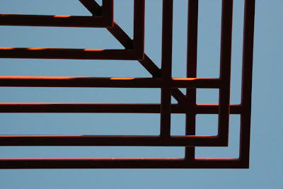 This is the "Before" Photoshop manipulation photo. It is a metal grid that holds a large outdoor light in a parking lot. I was instantly attracted to the linear graphic pattern. There is no telling what I will stop to take a photo of. I'm sure many people think I'm a bit strange! LOL
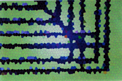
This is the "Before" Photoshop manipulation photo. It is a metal grid that holds a large outdoor light in a parking lot. I was instantly attracted to the linear graphic pattern. There is no telling what I will stop to take a photo of. I'm sure many people think I'm a bit strange! LOLThis is the "After" Photoshop Manipulation photo. It still has the same basic structure but I think it's more exciting. Here's how I did it, more or less. Keep tweaking the numbers until you get the effect that works best for your photo.
1. Choose Layer/Adjustment Layer/Color Balance and move the sliders until you get a color you like. You can select different color combinations for the Shadows/Highlights/Midtones.
2. Make sure your background layer is highlighted. Select Filter/Texture/Stained Glass. Move the sliders for different effects. Smaller cells will result in an image that resembles the original. Larger cells will be very abstract. Here are my parameters: cell size: 7, border thickness: 4, light intensity: 4.
3. Choose Layer/Flatten Image/Save As: jpg. If you want to save as a Photoshop file, do not flatten image.
Make sure you play with all the sliders and try to keep notes on the effects you like. Otherwise, you won't remember how to do it again! Hope you find this helpful.
November 12, 2007
Newest Creations
I've been busy with several projects. In an earlier post, I mentioned a challenge from Fibervision called Revision or Regurgitation. We exchanged UFO's with each other and finished them. We could do anything we wanted to it and it remains ours. The piece I received was odd shaped pieces of purple seminole. There were so many seams, I felt it would be difficult to use in any other way but as a background. I cut and pieced the shapes to make a background and proceeded to applique organic curved shapes. The first layer is cotton, some hand painted, some commercial. The second layer was beautiful organza ribbon I purchase in San Francisco. The third layer is yarn. It measures approximately 18 x 30".
This next piece was re-made from a large, over-sized (did I mention HUGE) blouse. I purchased it at a fiber sale put on by our guild. The fabric was gorgeous and it only cost $5.00, so of course I had to have it. 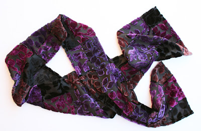 The fabric is cut velvet with a black sheer background. It looks and feels wonderful. I've only used 1/3 of the HUGE blouse, so I have plenty left for another project. I'm thinking either a vest or a handbag.
The fabric is cut velvet with a black sheer background. It looks and feels wonderful. I've only used 1/3 of the HUGE blouse, so I have plenty left for another project. I'm thinking either a vest or a handbag.These are two of the paper ATC's I created for our exchange this month. You may remember the background above from an earlier post. It was created with paint and salt. I stamped and embossed and glued snowflakes on top. The holograms are b&w brick buildings, the image changes as you change the direction of the card. 
This piece was created by painting gesso on a plastic shape and transferring onto the paper. It was painted with watercolors, metallic powder and then highlighted with metallic ink. The strips and rectangles are copper foil.
November 6, 2007
Architectural Inspirations
For the past month, I've been walking all over Santa Barbara during my lunch break. I've been fascinated by the architecture and decided to go back to some of my favorite places with my camera. Here are a few of the place I photographed today: This is Jimmy's Chinese Restaurant. It is a historic landmark and is about to undergo renovation. I LOVE the colors and hope they don't change it.
 This is a wall at the Historical Museum. I love the layers of decaying color and texture next to the new window shutter.
  This is a restored bedroom at the Presidio where the Spanish soldiers slept. Every single brick used in the construction of this building were made by hand and baked in the sun.
This is Jimmy's Chinese Restaurant. It is a historic landmark and is about to undergo renovation. I LOVE the colors and hope they don't change it.This is a wall at the Historical Museum. I love the layers of decaying color and texture next to the new window shutter. This is a restored bedroom at the Presidio where the Spanish soldiers slept. Every single brick used in the construction of this building were made by hand and baked in the sun.
October 27, 2007
Fiber Postcards
Today was a busy but fun day at my Fibervision meeting. We unveiled our Revisioned Challenge pieces. All were wonderful, some amazing. Mine isn't quite finished yet . . . so I'll post a photo when it is done. We prepared our boutique items and fiber pieces for the Elverhoj Museum. Here are 4 of the 28 postcards I will have for sale. This one was made by discharging the fabric with bleach. Then red foil was added to the design.
 The background was sun-printed and stamped. Silk flowers and leaves were stitched on and a little foil was added to the flower center.
 This piece was transferred from a photo of a rock wall. The cracks are heavily stitched for a three dimensional effect.
 The background was sun-printed, then stitching and foil was added.
This one was made by discharging the fabric with bleach. Then red foil was added to the design.The background was sun-printed and stamped. Silk flowers and leaves were stitched on and a little foil was added to the flower center.This piece was transferred from a photo of a rock wall. The cracks are heavily stitched for a three dimensional effect.The background was sun-printed, then stitching and foil was added. If you are planning a trip to central California (Solvang, Danish capital of America), stop in to see this exhibit. It is called "Color & Cloth Redefining a Traditional Art Form". It is going to be amazing, if I do say so myself. I have two pieces on exhibit. I think there are around 50 pieces. Our reception is on Friday, November 16 from 5 - 7 pm and we have a panel discussion with the artists on January 6th. Hope some of you can make it!
October 21, 2007
SB Artist Trading Card Group
Here's the link SB Newspress to the two page article about my ATC group. Can't wait to see how many people show up next month.
I'm hard at work on my regurgitation challenge piece for Fibervision that is due next Saturday. I'll post some photos as soon as I finish. I'm also working on a seminole exchange for my Blockheads group. So much to do, so little free time.
I'm hard at work on my regurgitation challenge piece for Fibervision that is due next Saturday. I'll post some photos as soon as I finish. I'm also working on a seminole exchange for my Blockheads group. So much to do, so little free time.
Subscribe to:
Posts
(
Atom
)


