 This is the original photo with a little contrast added.
 I wanted to change the color dramatically, so I decided to solarized it.
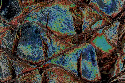 Next, I posterized it at a setting of 5. It didn't change it too much, but it added a lot of depth.
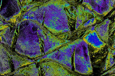 Here I've changed the colors by changing the master saturation to +60, the hue to +52 and the lightness to 0.
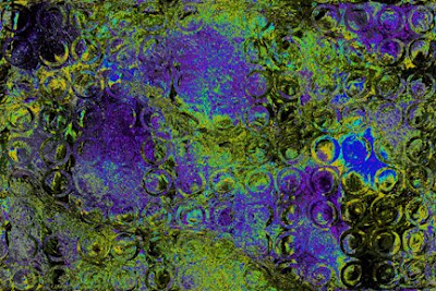 I've decided to displace a photo of circles. The horizontal and vertical setting was 70. The displacement map was stretch to fit and the undefined areas are wrap around. I like how the circles added texture to the large areas, but it's a little too obvious.
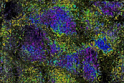 So, I added a tile filter. The number of tiles was 50, the offset was 20% and the background color was black. It knocked the circle back a bit and added another layer of texture. I like it, so I'll stop here.
Photoshop is a lot of fun. The more you play with the tools, the better you will understand what they do. Just remember to rename all your changes and Save As.
Image how surprised I would be if I opened the palm tree bark photo and found the altered image above!


 I wasn't prepared for how different it looked hanging vertical on the wall. When it was flat, I hadn't noticed the plaid design, the triangles within triangles, the diamonds,, the hexagons, etc. Every time I look at it, I see different shapes! The colors are gorgeous and the color values were handled beautifully. Great job, Kathy!
 Here's our next project. Not quite so beautiful, huh? I didn't really get the "before" photo. All the Juniper bushes have already been removed. Those itchy bushes should have been removed 20 years ago! All you can see in this photo are the stumps. Yeah!
 We also removed the Veronica bushes along the curve. We still need to remove all the
 Hopefully, you can see some of the hand stitching in the vertical


 The background is a hand-painted piece of fabric. The mountains, clouds and sun were formed using layers of tulle and the raw edged flames are made from organza and commercial cottons.
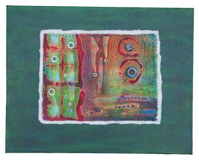 Spin Cycle is, by definition, a whole cloth quilt. The top is one piece of fabric that has been painted, then stitched, and embellished with hardware. Yes, you read that correctly. There are brass washers and silver lock nuts in two different sizes and of course, beads and embroidery. And, once again, the batting is exposed. Don't you just love the colors and textures in the close-up photo?
 Do you name your pieces? If so, how do you chose a name? Does it pop into your head when you're in the shower? Do you dream about it? Do you find the process difficult or easy? I would love to hear from you.
 For this piece, Andi pressed a 2" x 10" plastic packaging piece onto the red gelatin plate several times.
 I think I used a combination of baby blue and grey on this piece. I pressed a face stamp all over the paint.
 We used berry baskets and plastic netting from fruit boxes for the first print. Once dry, we inked the plate with yellow and pressed a potato masher into it.
 First I ran a notched squeegee through the paint, then I stamped into it with a large grid. When it was dry, I used purple paint to stamp the large grid on top.

 I had fun arranging the cross-sections into various compositions. Andi thought they looked like ladybugs. What do you see?

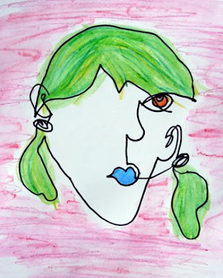
 Crayons, Shiva oil sticks, pastels, dye sticks and charcoal are among some of the materials used to produce the rubbings on either paper or fabric. Some of the rubbings looked great with pastel but didn't show at all in crayon. Some looked great on fabric, but awful on paper.
 These flowers were printed with a
 I had a bunch of "ugly" pieces of fabric that needed a little something, so I used Shiva oil sticks and dye sticks to add a little texture. I used a commercial rubbing plate for the


