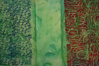
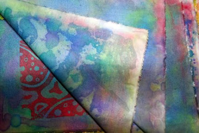
 This sample shows two layers of stamped fabric and the plain fabric that picked up the excess paint.
This stack had one stamped fabric and two pieces of white fabric. It really picked up some really interesting textures. It would be interesting to use the same stamp on top of the painted background to see how different it would look.
And what is this? Perhaps a piece of beautiful granite. No, it's my new printing mat. I assembled it today using insulation board, carpet padding, vinyl and duct tape. It's 2 feet wide by 4 feet long, so now I'll have a great surface to print on and clean up will be a snap.
As I was getting ready for work this morning, my boss called to tell me our main highway was closed. I turned the radio on and heard that a gunman handcuffed himself to one of the highway overpasses. Traffic everywhere came to a standstill. The highway and surface streets become parking lots. So, I had a few unexpected hours to myself and decided to work on my printing mat. The SWAT team eventually took the man into custody and everyone went to work. What a way to start the week!


 The first two photos show the carved stamp and the printed fabric made with that stamp.
 I used
 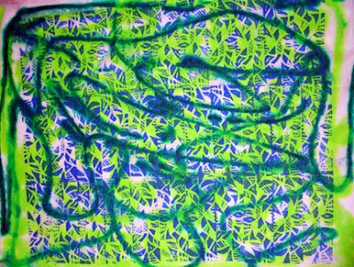 I layered this batch a little differently than the last one. I put a white piece of fabric down first, then layered the blue printed fabric face up. I sprayed it with water and squirted apple green and blue Dyna-flow on top.
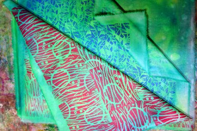 Then I added the red printed fabric face down and squished. Here's a photo of the stack when it was still wet. This is a great way to add a bit of background color to white fabric. I'll show you the final outcome in the next post.
 I used Jacquard
 This was pretty good, but it needed a little something.
 This first photo has some purchases from a store in San Jose that
  This is a sampler pack from
  Cut a hole out of an index card, I have 4 different sizes that I use. Move it over a magazine page, fabric, etc. until you see a composition that you like. Jeanne traces the design, but I have a hard time seeing the details through the tracing paper, so I just draw what I see.
 Turn each one around to see if a different orientation looks better. Choose a composition that you like and develop in whatever way suites your style.

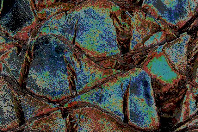 Next, I
 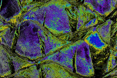 Here I've changed the colors by changing the master saturation to +60, the hue to +52 and the lightness to 0.
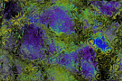 I've decided to displace a photo of circles. The horizontal and vertical setting was 70. The displacement map was stretch to fit and the undefined areas are wrap around. I like how the circles added texture to the large areas, but it's a little too obvious.
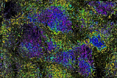 So, I added a tile filter. The number of tiles was 50, the offset was 20% and the background color was black. It knocked the circle back a bit and added another layer of texture. I like it, so I'll stop here.
 I wasn't prepared for how different it looked hanging vertical on the wall. When it was flat, I hadn't noticed the plaid design, the triangles within triangles, the diamonds,, the hexagons, etc. Every time I look at it, I see different shapes! The colors are gorgeous and the color values were handled beautifully. Great job, Kathy!
 Here's our next project. Not quite so beautiful, huh? I didn't really get the "before" photo. All the Juniper bushes have already been removed. Those itchy bushes should have been removed 20 years ago! All you can see in this photo are the stumps. Yeah!
 We also removed the Veronica bushes along the curve. We still need to remove all the
 Hopefully, you can see some of the hand stitching in the vertical


 The background is a hand-painted piece of fabric. The mountains, clouds and sun were formed using layers of tulle and the raw edged flames are made from organza and commercial cottons.


