Showing posts with label Setacolor paint. Show all posts

May 18, 2014

More Pounded Fabric

Here are the final two pieces from the Pounded Fabric experiment. Sometimes the best lessons are learned from your failures. This experiment is one of those lessons!

Fabric 3
 This is a fat quarter that somebody else dyed as part of an exchange. Not my style.

Not much better after the Setacolor and Lumier layer.

Front side. Another layer of Neopaque and Lumier. You can still see the stamped designs.

Back side looks a lot better than the front.
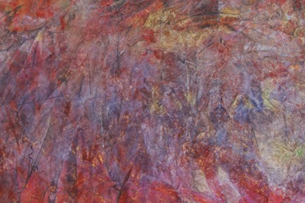
Fabric 4
I'm responsible for this piece. It has layers of rubbings with paint sticks. It's pretty bad.

 A layer of Setacolor and Lumier help, but it's still ugly.

Front side after another pounding with Neopaque and Lumier.

 The back side of this piece is probably the most interesting of all.

I like the combination of Neopaque and Lumier paint, however, I don't like this pounding technique. If I were to do this again, I would paint the damp fabric, then scrunch it into a bag to dry. At least I would know beforehand that all the areas that needed paint received it.

I'm not quite ready to give up yet and will do one final coat to all the pieces using my technique. I want majority of the underlying designs to disappear. Before I do the final layer, I need to finish the quilting on a piece that will go on exhibit at the end of May. 

May 16, 2014

Pounded Fabric Experiment

I read a blog post about Pounded Fabric and decided to give it a try. Of course, I didn't follow all of their directions. Silly me . . . will I ever learn? Probably not.

If I had started with a solid color of fabric like they suggested and didn't use transparent paint for the first layer, I would probably be done already. But no, I had to use some really UGLY fabric that I've been saving for some odd reason. Usually, layering makes the fabric more interesting. At this point, I'm not convinced that I should have wasted my time.

There are a lot of step by step photos so I'll only show 2 pieces of fabric today.

Fabric 1
 Hand dyed fat quarter. Not sure who made this, but it's not my style.
Squished fabric into a bag and added transparent Setacolor and Lumier paint. Still ugly
Squished fabric into a bag and added Neopaque and Lumier paint.
I still see the stamped design on the front side of fabric.
Back side of fabric . . . much better, but not great.

Fabric 2
All the steps are the same as Fabric 1.
I made this ugly fabric a long time ago using Soft Scrub with bleach.
 Setacolor made it worse.
 Front of fabric is still ugly.
Back of fabric is still ugly.

Am I completely wasting my time? Should I throw it away OR add one more layer?

March 13, 2011

Soy Wax Results

The paint has cured, the fabric was soaked in hot water and then ironed to release all traces of wax. Here are the results:
Fabric #1: I used a foam stamp for the grid and a cork for the circles.
Fabric #1: Layers of wax and paint

Fabric #1: Wax removed

Fabric #2: I used a foam stamp for the flowers
Fabric #2: Layers of wax and paint

Fabric #2: Wax removed

Fabric #3: I used a metal whisk to stamp the swirls.
The fabric looked identical with and without the wax layer. I suspect that because metal is a better conductor of heat, it made a clearer impression on the fabric. This was the final piece, so it's also possible that the wax was warmer.
If you are patient, and let the paint cure for 2 weeks before you remove the wax, very little paint will wash out. Next time, I'll use Dye-na-flow paint instead of Setacolor.
Lots of fun! If you decide to try this, I would love to see the results.

January 21, 2008

More Paint, More Depth

A couple of weeks ago, I posted photos of the first pieces that I painted. I left the fabric to dry overnight and didn't realize that it would continue to change until the fabric was dry. Was I ever in for a surprise the next morning! Both pieces were very pastel, the salt had sucked a lot of color out and our tables were uneven, so a lot of color slid off. Live and learn! They were nice, but I knew they could be better. So, I decided to add a second layer of paint and here are the progress shots. I paint in my dining room now, so the dry time is much shorter and my tables are even!The colors are so rich and they have so much depth now. I feel like they are finally finished.

December 30, 2007

Setacolor Transformation

Today my Fibervision buddy, Lora Martin, showed me a new painting technique that she learned from Phil Beaver. I saw some of Lora's beautiful painted fabric at our Fibervision Christmas Exchange and my inquiring mind had to know how. The technique involves stretched fabric, lots of water, Setacolor paint and salt. It is so much fun watching the transformation. Thanks Lora, I LOVE IT!
These composites will show the transformation over 4 hours. The white splotches are rock salt.This is Lora's beautiful painted fabric. We think the fabric is Kona Cotton. Water sat on the surface for much longer and it reacted differently than mine.

I painted both of my pieces at the same time, using the same color palette. The colors are more saturated in this one. This piece looks like flames.My paint was diluted with more water for this one. As you can see the final effect is lighter. I used Kaufman Pinatex for both pieces. For some reason, both of my pieces look like the shapes have been outlined with a dark marker. I certainly don't know why, but it's very cool.

The fabric and salt will remain untouched until it is completely dry. I believe the transformation is complete, however, there may be more surprises awaiting me in the garage!