Can you believe that I have more painted fabric to share with you? Once I got started, it was so much fun, I couldn't stop. Warning: Before you do this, cover your area with paper or plastic.

This first piece is
completely covered in Lumiere. It is quite shiny and stiff like paper.

You need to work fairly quick for this technique. This piece was painted with a 50/50 mix of
Setacolor and water. I used two blues and one red. After the fabric was painted, I added some creases for texture. I sprayed another piece of fabric with water and placed it directly on top of the wet paint. I pressed the fabric down and rubbed gently in places. The top fabric absorbed some of the color and resulted in a softer version.

This next piece was a new technique for me and I'm sure I'll do it regularly. You will need Elmer's Gel Glue, a foam stamp, fabric and paint. I used a 50/50 mix of
Setacolor and water, two blues and one yellow. This photo is showing you what the fabric looks like after it has been completely stamped with the glue. I used a foam brush to spread the glue and added more glue between impressions. Be careful not to add too much glue though, you will loose the details.

This shot is showing how it looked as I started to add color. The flowers magically appear as soon as the color is applied. Make sure to choose colors that will blend well.

Here's the piece
completely covered in wet paint. It was much darker than I had hoped and I thought that I had ruined it.

But the paint actually continued to mix together and it lightened considerably as it dried. The stamp became more pronounced as the fabric dried. It ended up looking like a beautiful batik!

I also ran six sheets of treated cotton through my
inkjet printer with wonderful results. I'm not going to show those though, I have to leave something as a surprise! Now I have so many beautiful fabrics, I'm not sure which ones I want to trade with my
Fibervision group.

 I also ran six sheets of treated cotton through my inkjet printer with wonderful results. I'm not going to show those though, I have to leave something as a surprise! Now I have so many beautiful fabrics, I'm not sure which ones I want to trade with my Fibervision group.
 For the base I used a sheet of stiff felt and arranged my fabric strips on top. I covered the whole piece with yellow shimmer tulle and did an allover meandering quilting stitch.
 I cut the the finished cards (2.5 x 3.5"), stitched each one with an additional linear pattern and satin stitched around the outside edge.
 This piece is a commercial fabric that had white on white roses. I bought it with the intention of painting it. It has 3 layers of different paints. Some areas are highlighted with metallic Lumiere.
 This began as a plain white
  It was actually painted in this horizontal orientation, but I flipped it around 9o degrees counter clockwise and loved the composition. I instantly saw a landscape and decided to add a palm tree that was left over from another project.

 This is the "Before"

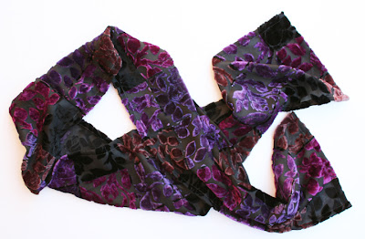 The fabric is cut velvet with a black sheer background. It looks and feels wonderful. I've only used 1/3 of the HUGE blouse, so I have plenty left for another project. I'm thinking either a vest or a handbag.

 This is Jimmy's Chinese Restaurant. It is a historic landmark and is about to undergo renovation. I LOVE the colors and hope they don't change it.
 This is a wall at the Historical Museum. I love the layers of decaying color and texture next to the new window shutter.
  This is a restored bedroom at the


