Showing posts with label screen printing. Show all posts

December 17, 2011

Long Blogging Break

I had many deadlines looming and was feeling a bit overwhelmed. I needed to FOCUS and that meant staying away from the computer. I hope I still have some followers after the long break.

Here are some fabrics that I've been trying to improve with a another layer of paint.
You might remember this one from a previous post. I used a banana slicer to do rubbings. They looked a little obscene, so I decided to disguise them with the purple squares. I think it needs another layer . . . maybe circles.
This piece turned muddy and dull and needed some spark. I added the grid stamp on top in a silverish blue. I think it still needs another layer . . . maybe circles! LOL
This fabric was really grey and ugly and was not usable for anything. I added the spokes and dots. The upper corner needs another layer but I haven't decided what yet.
This was a blue screen print on white denim. I filled the negative (white) spaces with dye-na-flow and it instantly became very colorful. I think this will make a nice bag.
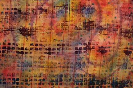
This was a very pretty (pastel) background with very regular patterns printed on it. It was one of my first attempts at fabric painting. It was too pretty and too regular and needed some chaos. It's getting better, but needs something else. Maybe circles!!??

I would love to hear your ideas on what the next layer should be.

June 6, 2010

O-So Many Layers

The Fibervision challenge is finally complete. Each panel features a piece of fabric that I made using a variety of surface design techniques (screen printing, sunprinting, dyeing, stamping).
The fabric was wrapped around a square of Timtex and stitched together. Each square is then stitched onto the painted canvas to form the letter "O". Each individual square also contains the letter "O" somewhere on its surface, in some cases, all over its surface.
A plastic bracelet was repurposed by wrapping it in translucent ribbon and stitching it to the Timtex. Screen printing, stamping and embroidery are the main techniques used in the square above.
The base of this piece was sunprinted with green and yellow setacolor and the blue was printed on top using a thermofax screen. The tiddlywinks were used to sunprint and then were stitched onto the surface.
Do you know where the inspiration for your art comes from? Generally, I'm not influenced by other artists work, however, this time, I remember seeing two wonderful pieces of art that influenced the layout of my piece. Perhaps I'm kidding myself, maybe I just don't realize how easily influenced I am. Hmmm . . . something to think about.
Take a look at Michelle's colorful piece. It has 9 mixed media squares on a fabric background. She combines recycled items, text and color in a very fun way.
The other inspirational piece was hanging in a local gallery and was made by Michelle y Williams. I instantly fell in love with it but my husband didn't. Unfortunately, the price tag required that both of us had to be in love with it. It is made from metal squares that have layers of paint and texture applied. Twenty five squares were nailed to a solid base to form a grid.
Are there any truly original ideas left? Probably not many.

March 18, 2009

More Thickened Dye Experiments

Here are the final two pieces I created during our Dye Day. 
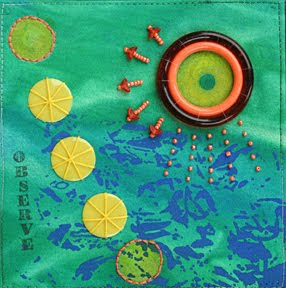
I used another bath mat to create the repeating squares. It had a strong architectural feeling, so I decided to add to it with a thermofax of a building. At the moment, this is my favorite piece.
This piece was created by drawing lines across circles on a screen, letting it dry and then printing with different colors of dye. Do you like the circles on the white background? It seems like the contrast is too much, I think it may need to be overdyed.

August 27, 2007

Colorful Weekend

Wow, what a colorful weekend I had with Sherrill Kahn. She is a warm, generous teacher that is willing to share everything she knows and encourages you to take it even further. If you enjoy playing with paint and experimenting, I highly recommend this workshop.
The paints we used are Lumiere which is a metallic paint and strong coverage. Textile paint is transparent and glazes the surface beautifully. Neopaque is strong, bold colors that covers completely. Sherrill's Sorbets are pretty colors that really pop and have amazing coverage. I have a better understanding of how and when each type of paint should be used.

These pieces have several layers of paint and were stamped rolled and scraped. Both of these designs were printed from a design I drew onto a Styrofoam plate. Different colors of Lumiere were used. The one on the right was outlined with gold Lumiere paint.
All three layers began with one application of paint. The first layer was wet fabric, the second wet layer had the images painted onto it: red grid, gold spots and red circles. The rest was filled with colors. A third wet layer was added and all pressed together and magic happened. After it dried, I took the layers apart and did a masking tape resist, stamping, scraping and outlining to each piece. I really like the way all three turned out.
I have done this on my own and have found many great designs this way. You cut a hole in a small piece of cardboard and move it over a photo until you find a composition you like. The painting on the left was inspired by a photo in a National Geographic, the one on the right was taken from my sketchbook and was inspired by a piece of fabric.

May 12, 2007

New ATC's

It's a lot fun to get to know other artists and trade these little cards. I must say, it is getting addictive! I like to try a new technique each month.

My card is at the top left. It's the one that looks like a paint splotch. The bottom layer was marbelized, the 2nd layer was screen-printed and the top layer was added with marker.