
I have an electric wok that wasn't hot enough for stir frying, but it's perfect for soy wax. I also have a little melt pot and Anne has a crock pot filled with soy wax too. I have tons of stamps, spatulas and found objects that are perfect for stamping.
What is all this for? A soy wax workshop with my Fibervision friends. I gave them the basic information about soy wax and off they went. They grabbed some fabric and tools and got busy.
There are little things you learn along the way about the different tools, but there is very little that can really go wrong. This group doesn't want or need many directions. Even if I told them exactly what to do, they would do whatever they wanted anyways! That's why I LOVE this group!

I really don't like starting with white fabric, so I dunked it into very diluted setacolor (before the meeting) and set it outside to dry. Here's one of the pieces drying in the sun.

This is what it looked like after it was dry. Much better than white.

This is my collection of kitchen tools that I use for stamping. It's amazing how many different mashers you will find once you become aware of them.

Xandra had some pieces that she painted in a different workshop. She brought them along to add a layer of wax and more paint. It looks like she really likes the swirly whisk.


 A simple piece of fabric with cut out circles. It didn't really look too exciting, but the possibilities were endless. You've probably noticed that one of my favorite symbols is the circle. I shouldn't have been surprised at my reaction to all these circles!
 The first step was to get it off the cutting board and onto piece of painted silk.
  The negative circles are exciting, however, the positive rectangle is just too plain and boring. The first step was to paint the surface with some diluted S
 The rectangular piece was cut into an organic shape and placed onto yet another painted background. Nice, but still not enough. Cells are incredibly colorful and the mellow yellow fabric was NOT going to make it.

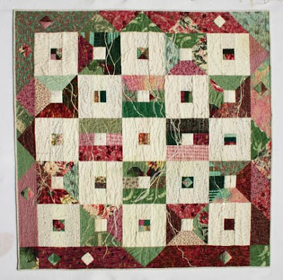 I had a very difficult time with this piece, because I know it took many hours to make. I didn't want to destroy it. I stared at it for months and often used it to cover up when I was chilly in my studio. I knew I had to do something dramatic to change it but what? Cutting it wasn't going to be enough and I couldn't take it apart because the quilting was quite dense. I decided to paint it.
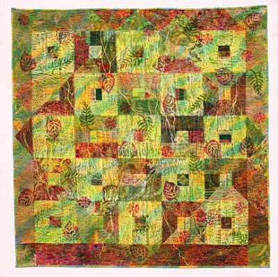
 This super bright combination uses
  This combination is Light Green, Buttercup and
  This combination is Cobalt Blue,
  This first piece is
  You need to work fairly quick for this technique. This piece was painted with a 50/50 mix of
  This next piece was a new technique for me and I'm sure I'll do it regularly. You will need Elmer's Gel Glue, a foam stamp, fabric and paint. I used a 50/50 mix of
  This shot is showing how it looked as I started to add color. The flowers magically appear as soon as the color is applied. Make sure to choose colors that will blend well.
 Here's the piece
  But the paint actually continued to mix together and it lightened considerably as it dried. The stamp became more pronounced as the fabric dried. It ended up looking like a beautiful batik!
 This piece has 2 yellows, green and blue-green. I placed washers on top as a resist.
 Circular shapes were painted using all five colors.


